Copyright © 2025- Conor Smith. All Rights Reserved.

Deco Stellario
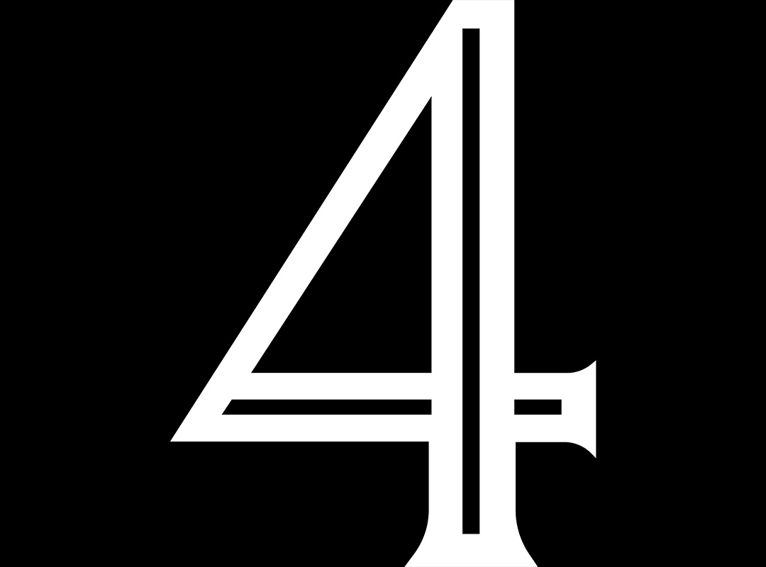
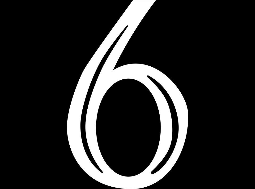
For my typeface Deco Stellario, I crafted a custom Art Deco–inspired alphabet rooted in the 1920s speakeasy myth developed in my case study. Drawing from the era’s geometric elegance and the storytelling behind the fictional underground bar, I designed a full uppercase font that merges period authenticity with modern refinement. This one-weight display typeface showcases my ability to translate narrative world-building into functional design. Below, I have case study pdf for what led and went into this project.
Font Design


Numbers


Selected Works
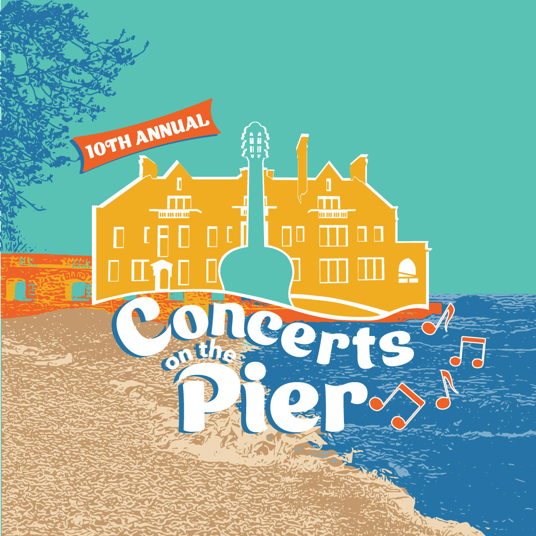
Concerts on the PierMarketing Campaign

Advertising (Print & Digital)Marketing Campaign
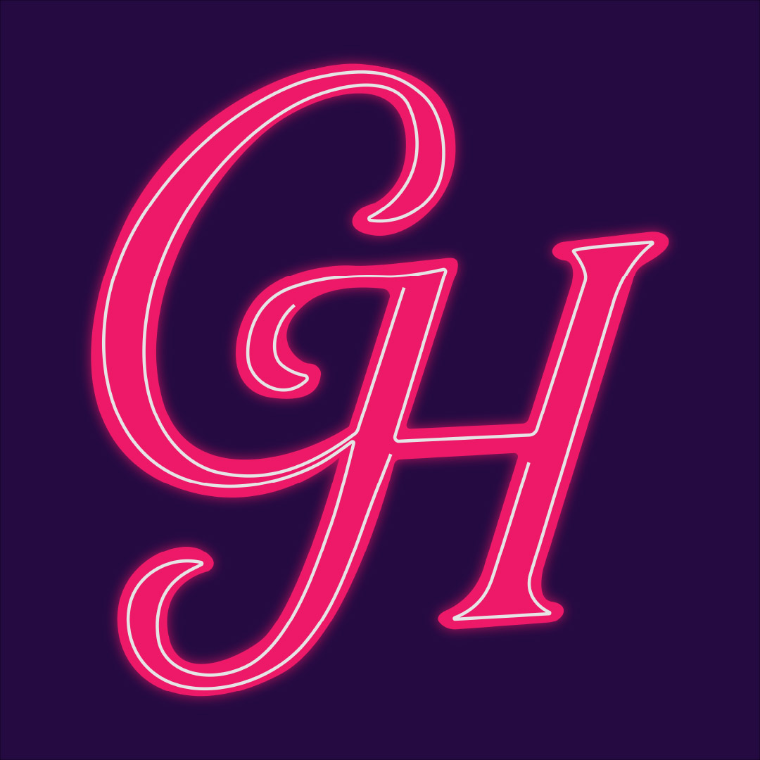
Get Her Hired - LogoFreelance for Kate Wade (CEO)
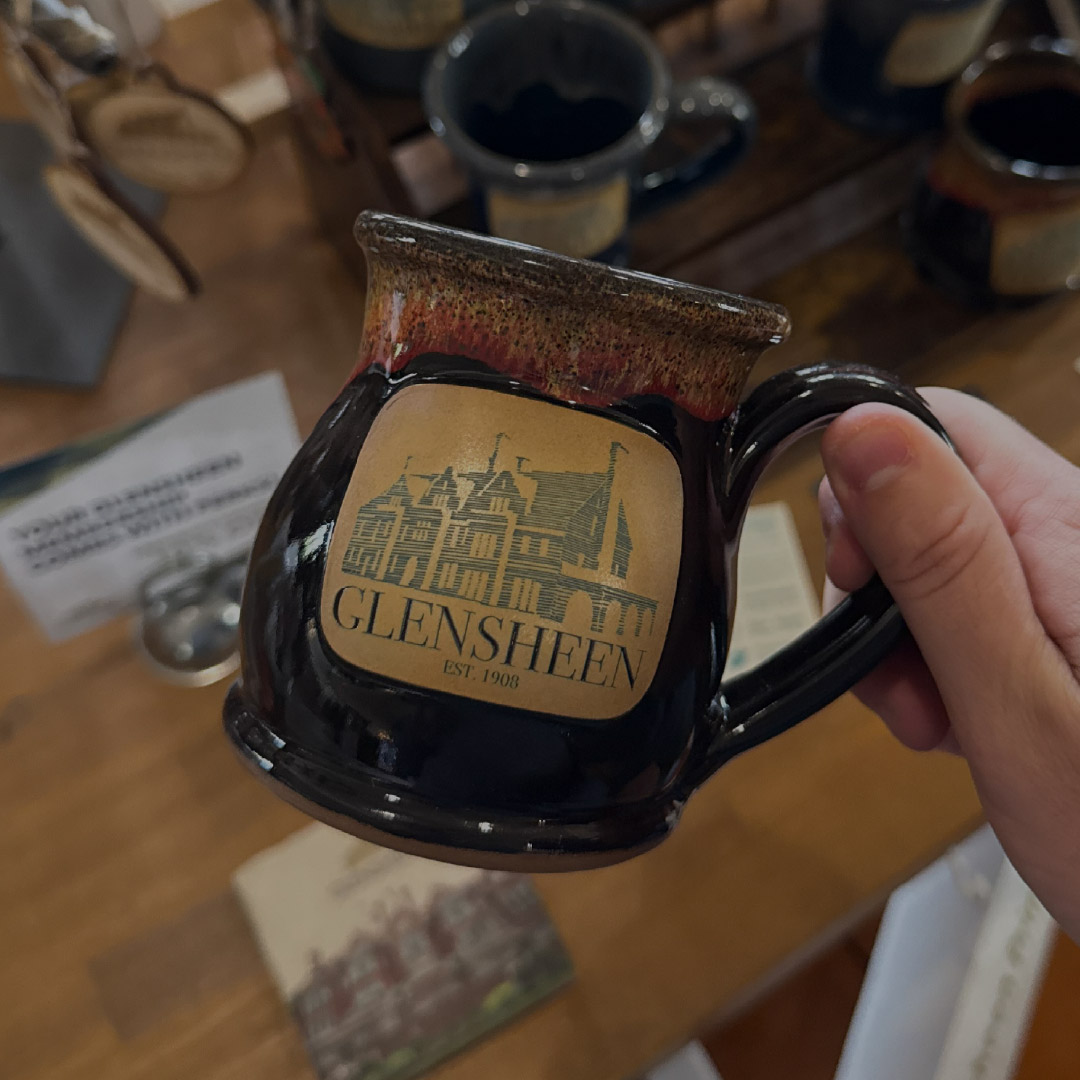
Merchandise DesignGlensheen Museum Shop
Deco StellarioFont Design
Nordhaven CollectiveBrand Design

Tio's Twisted(Conceptual)

MulligansFestival Design
Vovo's Package Design(Conceptual)

Appalachian ArtsBrand Design